Website usability testing is a product usability test for end users. The QA engineer evaluates the site and identifies interface shortcomings when applying this testing. The presented article describes how to do website usability testing, including its purpose, varieties, and methods. Usability testing is applied across various IT- spheres and serves to check:
- possibility of user scenarios (fulfillment of target actions in a minimum time),
- site relevance and user loyalty – for comparison with competitors' products and to assess the attractiveness of the product to users,
- understandability of navigation, or general "orientation in space" (whether it is possible to quickly find the desired item in the catalog or function in the menu),
- usefulness, completeness, and accessibility of the content – how transparent the information is to the user.
Usability testing can be carried out at various stages of site development. Still, it is best to do it directly in the interface design process before making changes to the product code. This will allow for correcting all the interface shortcomings quickly and with minimal cost. In addition to this, usability testing:
- Facilitates selecting the most suitable interface design from all developed options.
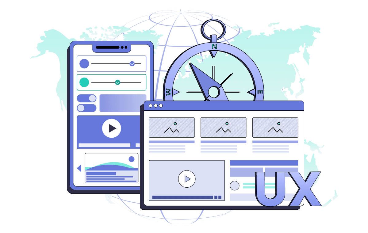
- Assesses the website's adaptability for potential users from various countries, mainly when the interface includes options for language switching.
- Сhecks and determines the usability of websites and applications, both desktop and mobile.
Usability testing is essential to ensure a positive user experience and satisfaction.
Why do we need to conduct usability testing for the website?
Global Goals. Usability testing helps to understand why users leave without performing a targeted action and increases conversion rates.
Narrow goals. Testing is done to check how user-friendly a website is in the following scenarios:
- finding products, services, or blog articles;
- adding a product to the shopping cart and placing an order;
- navigating within the personal account;
- obtaining details about the company's services;
- getting answers to frequently asked questions;
- contacting a consultant.
During testing, it is possible to accidentally identify bugs in the site's functionality: in the interface or the server part.
Testing scenario
The level of detail in the scenario and the number of steps involved depend on the testing task. Consider some of the options.
When you don't need a detailed scenario: you want to find out why users don't use a particular feature or have a hypothesis you want to test.
For example, you want to know how easy it is to find an article on a QA topic on a website. You don't need a detailed step-by-step script. Search for the article through the blog sections or the search box on the site.

A page where you can check how users search for blog articles.
When you need a detailed script: you already know the problem areas on the site. In this case, the script includes the steps where users most often stumble.
When it is worth testing
Testing web applications is not an end but a tool for achieving business goals, so there is no strict periodicity with which it should be carried out. The reason may be some changes in the work of the site:
- when launching a new site: it is worth checking how logically everything is organized, whether the interface is straightforward;
- when there are problems on the site: you notice that users begin to leave more often, especially after adding items to the shopping cart;
- when you change something on the site: such as introducing a new search algorithm in the catalog, updating the appearance of product cards, or redesigning large blocks.
Also, to improve the site's performance, we will help you answer how to automate testing of web applications.
Checklist: How to do website usability testing
Checklist: How to do website usability testing
Determine the testing tasks. They depend on how long the site has been functioning and whether you have specific hypotheses you want to test.
Make a script. It should be detailed if you want the respondent to go through the steps you consider problematic on the site. The scenario can be short if you want to test which paths the respondent will take to reach the goal.
Appoint moderators. It's good if it's someone who is involved in the development of the site. For example, your marketer, developer, or designer.
Invite respondents. It is better to look for them among your target audience, for example, current customers. You can also invite people through special services.
Conduct testing. This can be done online and offline, with or without a moderator.
Analyze the results. To do this, you can make a table or a graph or write in the thesis what problems the respondents had most often.
Now that you have identified the errors and seen the wishes of your target audience, make changes to the site. You need to take the report to the website developers and discuss how to improve usability with them. Implement the changes as soon as possible.

Use our experience to optimize your testing processes. Fill out the registration form for a quick start!
What should be checked on a site?
We know a clear website testing strategy is necessary to succeed and obtain a high-quality website. If a website has a clear interface, users will place orders more often, read the blog, and browse the catalog longer. Therefore, it is necessary to conduct usability testing of the site. Below, we will look at what specifically to check:
- Technical audit (loading speed and absence of errors): The main page loads in 1-3 seconds (ideally, all other pages do too). The site has a minimum number of technical errors.
- Adaptability: The site is convenient to use from different devices (smartphones, tablets, desktops).
- Home page: Once on the home page, users immediately understand your company's products or services.
- Navigation: The site has a clear, simple structure and a prominent search bar. All elements, from the domain to headings and buttons, are perceived by users.
- Uniformity of the interface and forms: All pages and forms of the site have a similar structure and design.
- Readability: The design of texts does not hinder the perception of information.

Let's consider each point in more detail:
Technical audit
Visitors feel comfortable when a page loads in 1-2 seconds. Suitable hosting and site optimization will help to achieve such speed. An optimized page has a simple structure, minimized code, and no heavy forms.
In addition to loading speed, the site must have minimal technical errors. They are directly related to the perception of the quality of the site. It is obvious that non-working buttons, broken links, or incorrect layouts negatively affect users' opinions. Try to avoid technical errors or promptly eliminate them.
Adaptability
This is the ability of the site to look good on your desktop, smartphone, or tablet. To achieve this, you can use an adaptive layout or make a different version for each variant.
Choose an adaptive layout if the site has a simple structure and little content (for example, a business card site). Thanks to it, the page elements are adjusted to the screens of tablets and smartphones.
If the site has a lot of sections and content, prepare a separate mobile version. As a rule, this is an incomplete version of the site, in which the main sections and features are placed on the main page.
For example, the large number of elements and small font makes it difficult to read the text. And there is also a chance to click on the wrong page.
Home page
It is the main page that expresses the primary message of your site. Ensure that on the home page, the user grasps your company's purpose and your products or services.
Navigation
The site should have a simple structure and organized menu; then, the user can perform the target action quickly. The following settings help to navigate the site:
- Clickable "breadcrumbs" (the path from the home (main) page to the current page). Thanks to them, the user understands the current site level and can go to the level above in one click.
- The "Top" button if the page occupies more than one screen. This allows users to return to the top swiftly with a single click.
- The ability to return to the main page via a clickable logo in the header or a text link in the footer (information block at the bottom).
- The back button in the browser works correctly on all site pages. So that when clicked, the user is taken back a step, saving the configured filters/forms. Site search will allow the user to find specific products/services/articles. It is customary to place the search bar (or magnifying glass icon) in the top right corner.
- Choose a domain related to your business or brand name to make it easy to remember or type.
Uniformity of interface and forms
The design and structure should be consistent across most pages. If all pages are laid out differently, the user will not have a solidified image of your site as a cohesive whole. Orienting on the chaotic disparate pages is more complicated.
Take care of the uniformity of forms (input) on the site. It is welcome if they look the same on different pages. Required fields and examples/tips for completing them must be indicated.
Readability
The last general rule is that text layout should not distract the user from the content. To do this, choose a suitable font for reading and stick to the rule of contrast: dark colors for the text and light colors for the background or vice versa.
Remember that you write texts primarily for users, not for the search engine. The text on the site should not consist of incoherent key phrases or repeat the keyword in every sentence.
What to check in web design?
In the last section, we looked at the basic parameters; this time, let's discuss web design principles. The visual component is the first thing users encounter when they visit a website. According to the research of InstantShift (An English-speaking digital community), for 94% of people, design is the measure by which they determine whether the site is trustworthy.
In a narrow sense, design refers only to the design of a website's appearance. In a broader sense, it serves as a bridge that connects the user and the service. Its primary purpose is to be functional and convenient.
- Functionality and moderation. Ensure that the design does not distract users from the content of the site and the intended action.
- Composition and Accents. Carefully consider structure and place accents so users don't miss the necessary information.
- Color scheme. Choose appropriate colors that will not merge and make reading difficult.
- Uniformity of elements. Make sure that similar elements on different pages maintain uniformity and consistency.
- Typography. Format your texts so that they are quick to browse and easy to read.
- Quality of visual content. Use original visual content to illustrate essential points.

Let's look at some points in more detail:
Moderation
When we visit a website, we scan it with our eyes to find what we came for. If it is an online shop, we look for the products we are interested in; if it is a media portal, we look for the latest articles we want to read. But it is difficult to find what you need if the pages contain unnecessary information (blocks and "decorations").
Remember that web design is not a self-contained arrangement or clutter of elements. It should be functional. That is, it should solve users' tasks. Therefore, one of the key points of web design is moderation. What to focus on to avoid unnecessary elements on the site
- Remove everything secondary and irrelevant to the purpose of users from the main page. Leave only what will bring them up to speed and, answer their main questions, tell them about treating their "pain."
- Make room. Ensure there is plenty of whitespace or "air" on the site. It makes content stand out, enhancing user focus.
- Disable autoplay videos, loops, and gifs. Instead, allow users to initiate playback by including a visible "Play" button. Also, avoid motion and flashing in the background, as it can distract from the content.
- Be creative in moderation. Authorship is an embellishment to a website but can be overdone in interfaces. If there is too much creativity, it can overshadow the usefulness and purpose of the service.
Composition and Emphasis
Composition is how the parts of the whole relate to each other. Accents are how elements are emphasized. If the site does not have a clear composition, it immediately catches the eye. It is "unclear what the author wanted to say." When creating any site, the composition laws should be considered.
You can argue that the composition and accents depend on the type of site, business, or individual. Undoubtedly, the logic of the arrangement of elements of the online shop is different from the placement of blocks of news portals. Yes, even the composition of the two shops may not coincide.
But there are basic principles. They base on how attention and human perception work. Without considering them, you can not make a coherent and understandable site.
Rule of thirds
Stick to the rule of thirds. It came to design from painting and is related to the golden ratio. To apply it, overlay a "grid" to the page, dividing it into three equal parts along each side. You will get nine equal rectangles. The four center intersection points will attract the most attention.

It is wise to place anchor objects and accents because these areas unconsciously attract most people's eyes.
Scanning patterns
The top left corner is the point of reference in the coordinate system. In most languages, text is read from left to right and top to bottom: the eye similarly moves across a website page. As it moves, it follows the letter F's lettering. Top bar from left to right → bottom bar in the same direction → vertical section from top to bottom. Knowing this, place important elements in the sequence of the F-pattern.
In addition to it, there is the Z-pattern. It is characteristic of sites with landscape positioning. The eye glides along the trajectory of the letter Z: top bar from left to right → diagonal → bottom bar from left to right.
Accents
Don't forget the effectiveness of simple accents. An accent highlights an element from a series of similar ones. It attracts attention because it is different from the others. Accents can be done in a variety of ways. From highlighting by color, size, and location to non-standard animation.
Colour scheme
Colors used in the interface affect the site's perception and the user's mood. Too bright or incongruous, they can cause unconscious rejection. Therefore, the choice of colors should be taken seriously. Here's what you should focus on:
- If the brand has corporate colors, use them. This increases recognition and builds trust.
- Avoid colors that do not fit or resonate with the site's theme.
- Use 2-3 colors in the interface design. The more colors, the more difficult it is to combine them harmoniously. For three colors, use a 60-30-10 ratio. 60% is a one-color background, 30% is colors of illustrations or text, and 10% is for accent elements.
- Choose background colors that are not bright and do not interfere with the focus of the content. White and shades of grey and beige are suitable.
- Make elements contrasting, i.e., different in brightness.
Uniformity
The design should be consistent and uniform. Inconsistent design occurs when similar elements on various pages are different. This applies to the size of indents, headings at the same level, and the similar organization of icons, forms, and active and inactive elements.
Typography
Textual information is present on all websites to a greater or lesser extent. The most important thing is to make the text interesting, understandable, and useful to your target audience. But if a text with good content has basic design, it will reduce effectiveness. The rules of text design are called typography. This is a separate area that requires a deep dive. We have highlighted only the main tips that increase the readability of the text:
- Break the text into paragraphs of up to 10 lines. This helps to avoid a continuous sheet, which is hard to perceive.
- Use optimal kegel size of the main text: 16-20 px. The small font does not make you want to dive into reading. Combined with a text sheet, it hinders readability and causes eye strain.
- Ensure that internal identifiers are smaller than external ones. Let's look at an example. If you set the line spacing to 1.3, the spacing between paragraphs should be at least twice as large (from 2.6 px). This allows you to group similar elements and separate them from others visually.
- Make the headings' size different from the main text size.
- Moderate amount of emphasis. Above, we talked about emphasis and minimalism. It's time to combine these two principles into a third. Do not overdo it with selections. If the text is bold and combined with italics, underlining, and color boxes, it will have the effect of a bomb exploding. But in a negative way.
- Do not use more than three fonts. Otherwise, there will be a feeling of sloppiness and chaos.
Content quality
Toward the end, let's touch on the obvious. Don't use low-quality visual content. This can include poorly optimized images and videos that load themselves slowly and reduce the site's loading speed. Stock photos that are full of pixelated images. Small amounts of pixels in images turn them into mush on high-resolution screens.
Website usability testing: What to check for better communication on site?
In this section, let's touch on website communications with customers and how to make them convenient.
Online chats. Operators quickly answer users' questions. The chat window does not interfere with the site's work.
Feedback form. It is not hidden, and it is easy to send a message through it.
Subscription forms, pop-ups, and push notifications. Don't bore users.
Service texts are written in human language.
Contacts and social networks. Easily find contact information and company pages on social networks.
Reviews and comments. Customers can leave feedback on your website.
Any means of communication are a direct channel between the organization and the client. They demonstrate the company's openness and help potential customers make decisions based on the experience of others.
In conclusion, website usability testing is a cornerstone for crafting user-centric digital experiences. This journey through methodologies, insights, and best practices underscores the importance of placing users at the heart of web design. By rigorously applying usability testing, we enhance user satisfaction and drive engagement and conversion, ensuring that websites are accessible, intuitive, and delightful to navigate.
As digital landscapes evolve, the commitment to usability testing will continue to shape the future of web development, fostering environments where users feel understood and valued. Talk to our team, and you will learn more about how to conduct usability testing for a website with a personalized approach to your project.
Comments
Share your opinion, join the discussion!
Alexis R. Ware
10 months ago
I appreciate how this blog brings attention to website usability testing and its importance in driving engagement. The examples are very relevant.
For 8 years, we have helped more than 200+ companies to create a really high-quality product for the needs of customers.
- Quick Start
- Free Trial
- Top-Notch Technologies
- Hire One - Get A Full Team
Was this article helpful to you?
Looking for reliable Software Testing company?
Let's make a quality product! Tell us about your project, and we will prepare an individual solution.
We focus on several key areas: navigation, accessibility, speed, design consistency, and user engagement. We test how easily users can find what they’re looking for, complete actions, and how well the website performs on different devices and browsers.
Usability testing should be conducted regularly, especially after significant updates or redesigns. We recommend testing at least twice a year or after introducing new features to ensure the website continues to meet user needs and market trends.
Any website that aims to engage users can benefit, but it’s especially crucial for e-commerce, SaaS platforms, informational websites, and service-based businesses. A well-functioning and intuitive website can greatly impact conversions and customer satisfaction in these industries.
The length of time depends on the size and complexity of your website. Typically, the testing phase can take between 1 to 3 weeks, including planning, testing, and analysis. At Luxe Quality, we ensure a thorough process to deliver actionable insights
At Luxe Quality, we combine our deep expertise in QA with a user-centric approach. Our testing is tailored to your business needs, ensuring we address not only technical aspects but also how real users interact with your website. We focus on actionable insights that directly improve usability, boost conversions, and enhance overall user satisfaction. Plus, our team can begin testing within 24 hours, ensuring quick and efficient results.